Mind the Gap
Brand Identity / Web Design
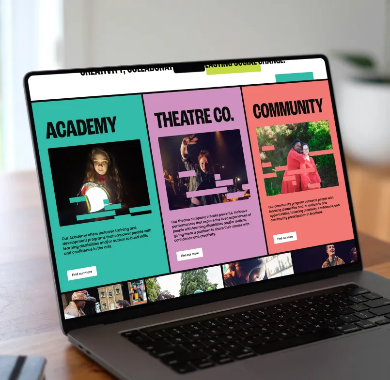
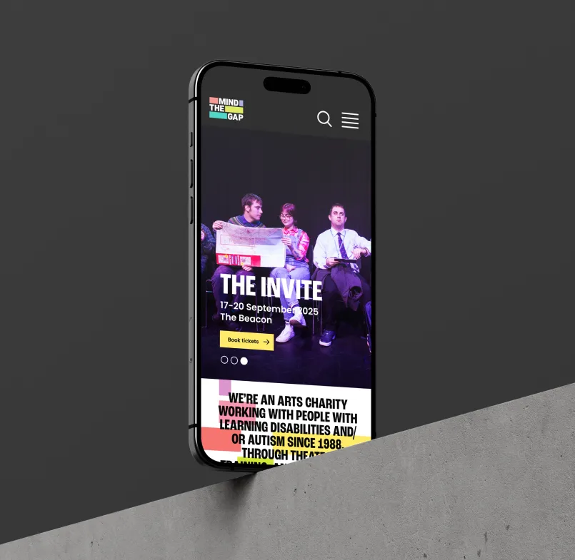
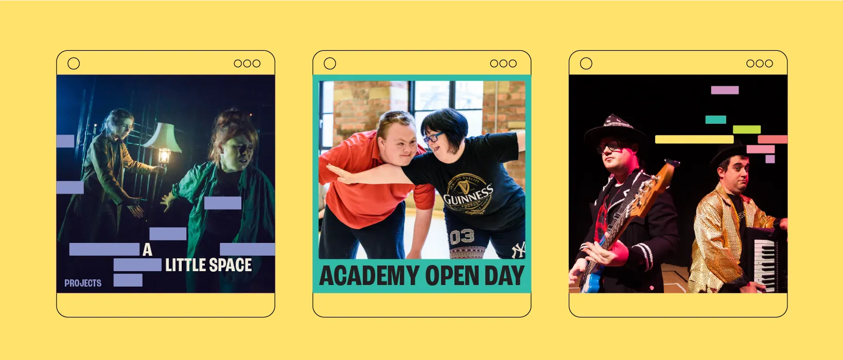
We created a new brand identity and website for Mind the Gap that amplifies their mission: collaborating with learning disabled and/or autistic artists to create bold, inclusive, and original theatre. The refreshed identity celebrates the vibrancy, creativity, and equality at the heart of their work, while the new digital presence provides a more accessible, expressive space for their stories to be shared.
Brief
Mind the Gap wanted to refresh its brand to better reflect its status as a fearless, buzzing, and pioneering disability arts organisation rooted in Bradford.
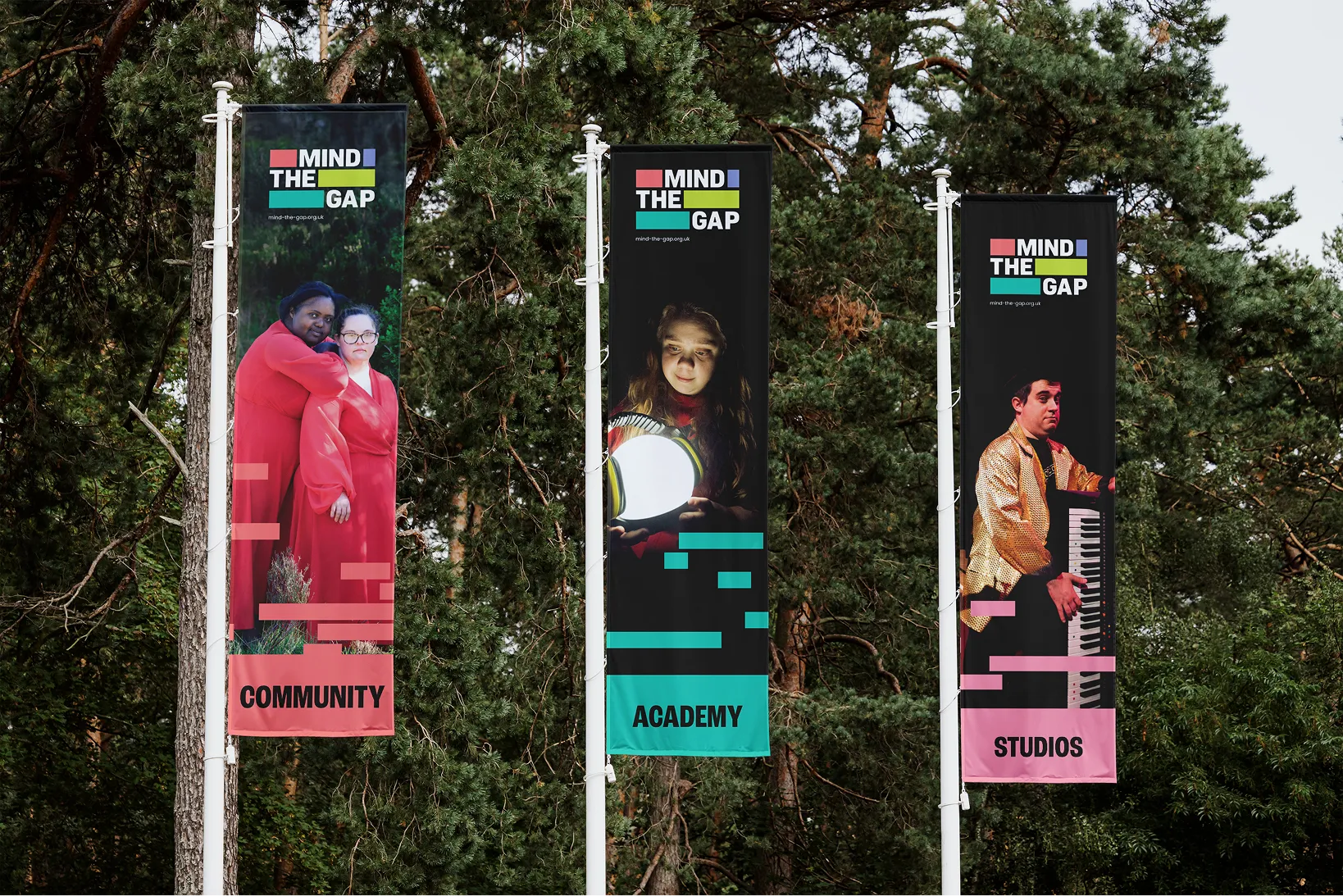
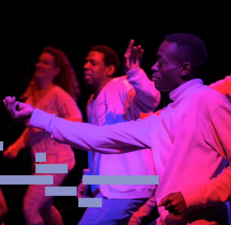
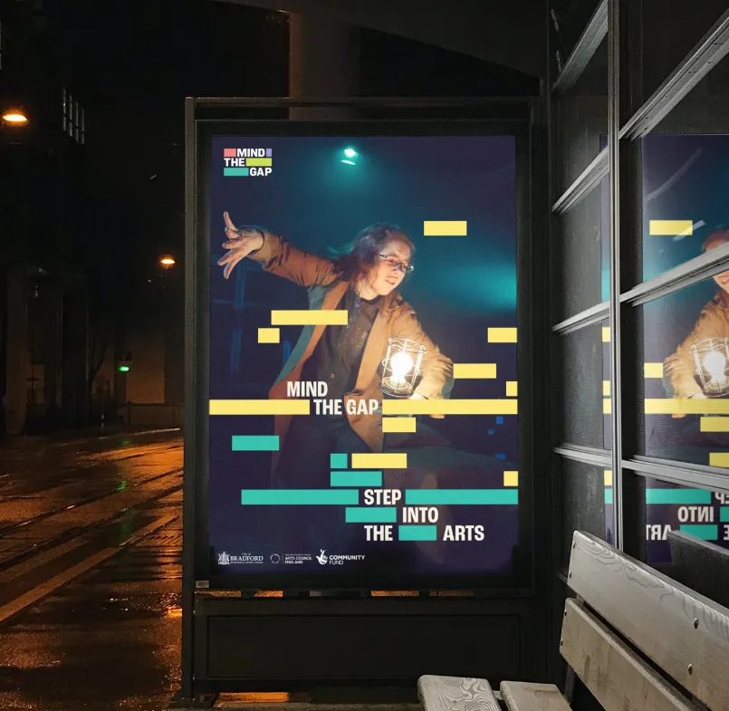
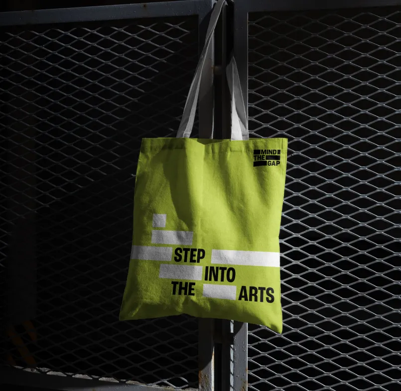
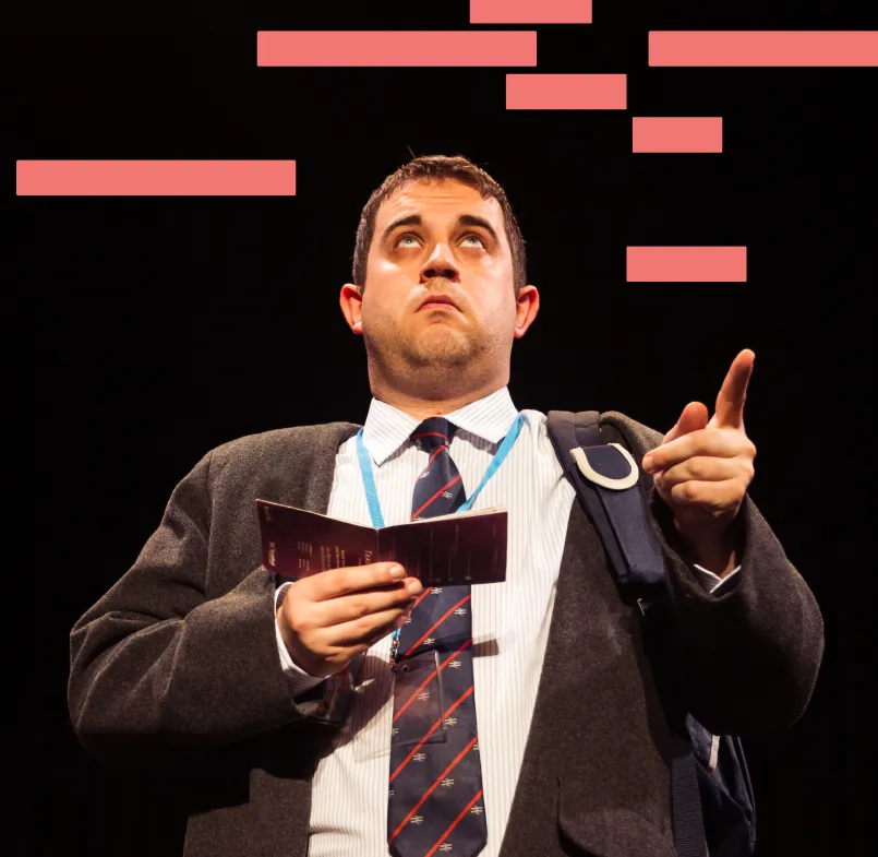
They wanted a new identity in order to present MTG as a confident, contemporary arts company - serious about its craft yet warm, accessible, and a quirky. MTG wanted to stay away from anything cutesy, conceptual, or cartoonish, instead embracing bold colour and strong portrait-led photography that celebrated learning-disabled and autistic artists.
The system had to be coherent, flexible, and easy for staff to apply across performance, training, and community engagement, while resonating with a wide audience - from prospective students and their families to arts programmers, funders, and local communities. The refreshed brand was to feel at home within the arts world without being exclusive, clearly communicating MTG’s legacy, quality, and commitment to pushing the sector forward.
Approach
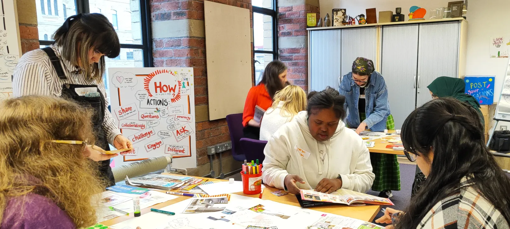
We conducted workshops in Bradford over several days. A strategic workshop and a separate and more emotive visual and tone workshop. In the spirit of Mind the Gap participants with learning disabilities and autism were fully involved and usually leading in all the discussions with the kind of powerful purpose and insight that can only come from a lived-experience led group.

Challenges
The main design challenge was balancing artistic credibility with accessibility - creating a brand that feels sophisticated enough for the arts world but still warm, inclusive, and never elitist or infantilising. Added to this is the inherent connotation of the name “Mind the Gap,” which is widely associated with rail transport; the brand had to overcome this reference and ensure the name felt artistic, purposeful, and rooted in disability-led creativity rather than literal or urban-infrastructure cues. The system had to be distinctive yet simple enough for non-designers to use consistently.
Solution
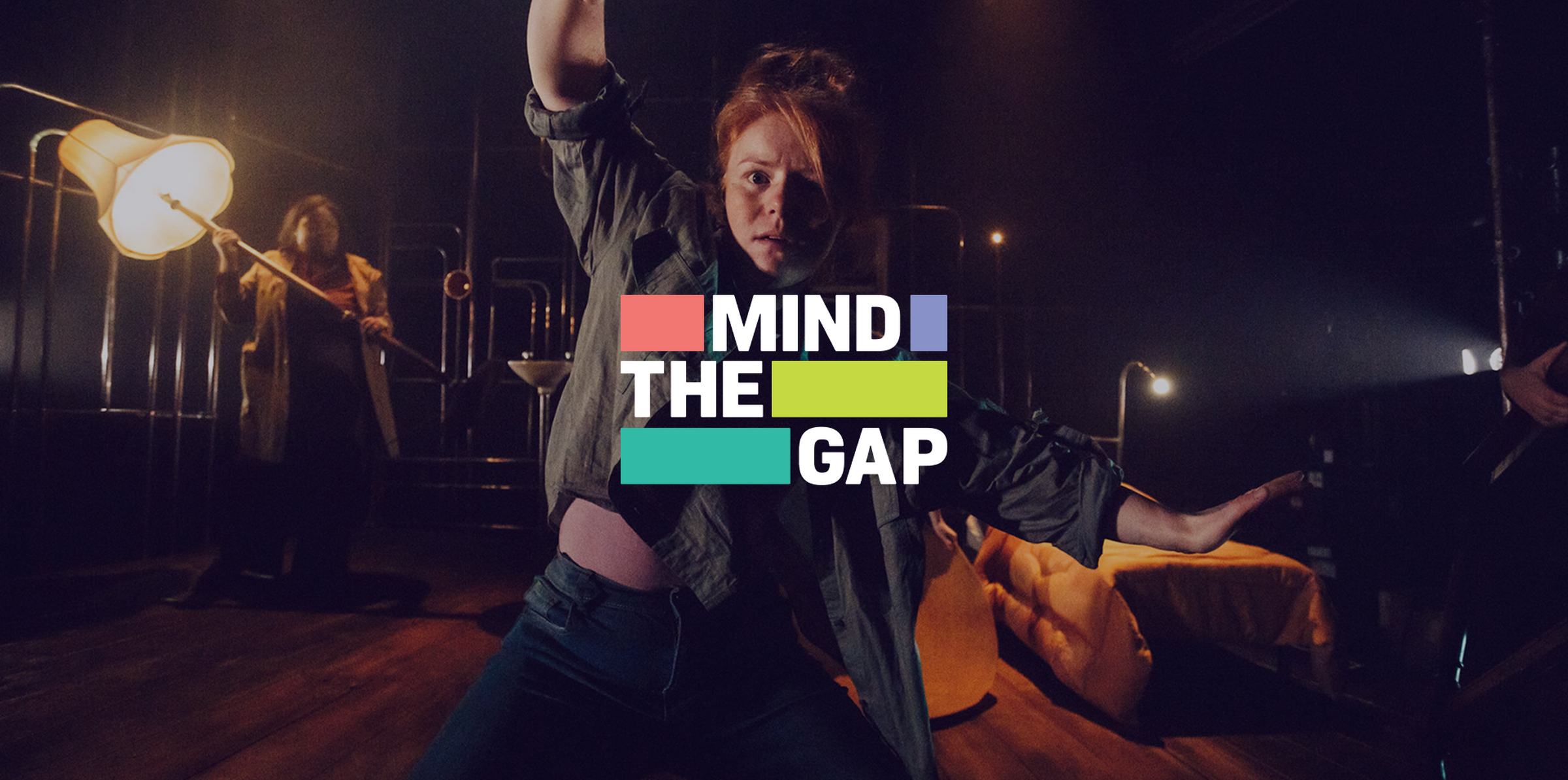
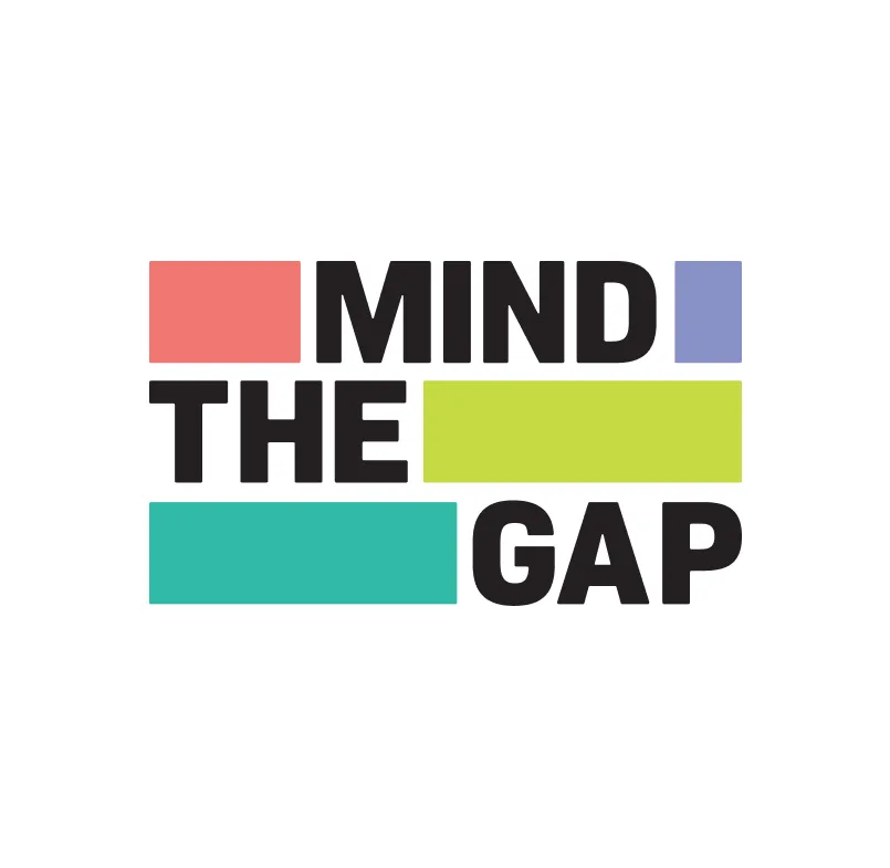
The new Mind the Gap brand centres on the idea of ‘gaps’ as symbols of opportunity, growth, and transformation - visual stepping stones that reflect the journey of learning-disabled and autistic artists as they build skills, confidence, and creative ambition. This theme directly connects to the strapline “Step into the Arts,” inviting artists, audiences, and partners alike to move forward, cross thresholds, and embrace new creative possibilities. These forms also spotlight the barriers that still exist in the industry, positioning Mind the Gap as an organisation actively bridging divides through professional pathways, collaboration, and advocacy. A flexible, expressive colour palette supports this narrative, pairing bold, vibrant hues with softer, more nuanced tones to create a system that can shift from energetic to refined depending on context. This versatility allows the brand to remain cohesive while adapting to the wide breadth of MTG’s work.