Katheti
Brand and website
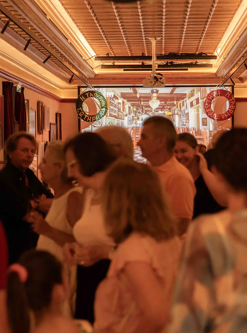
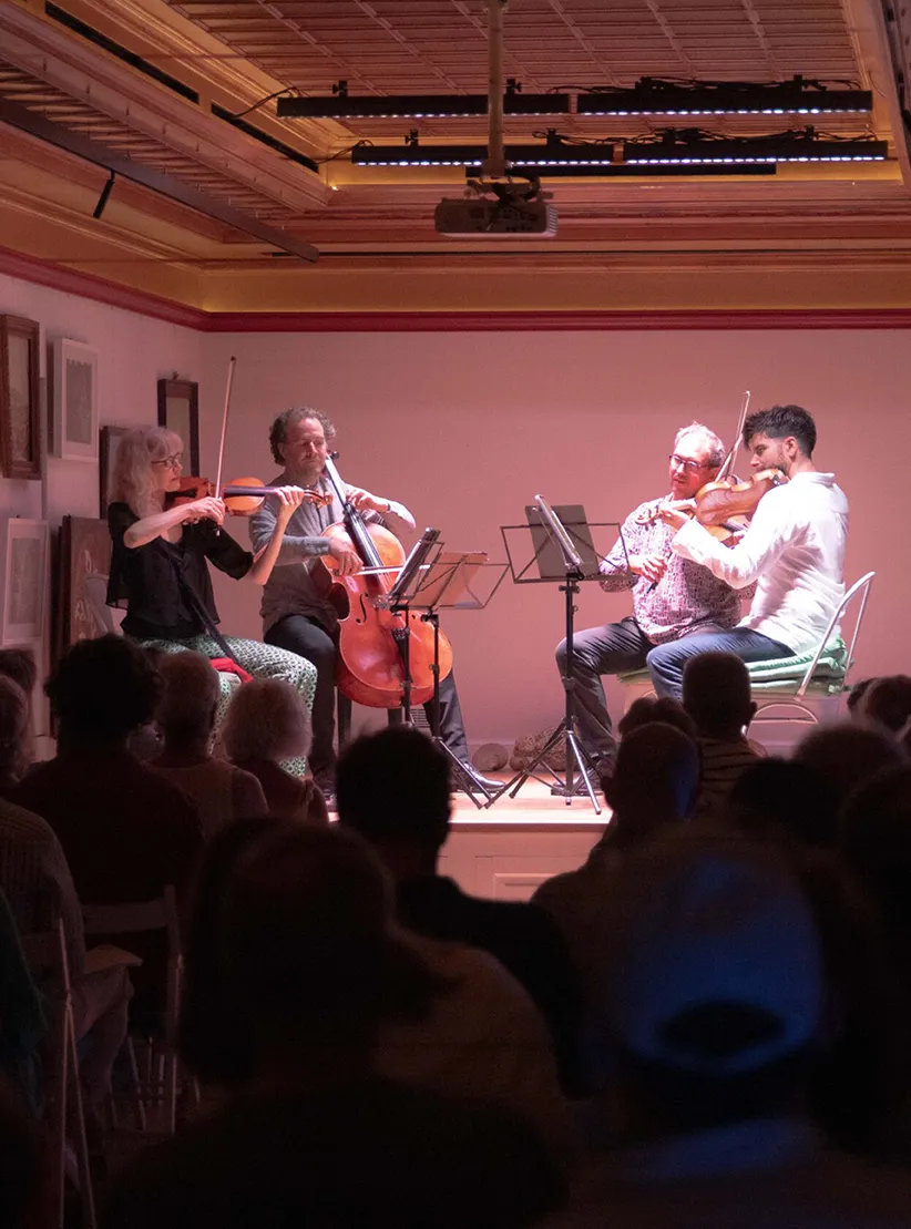
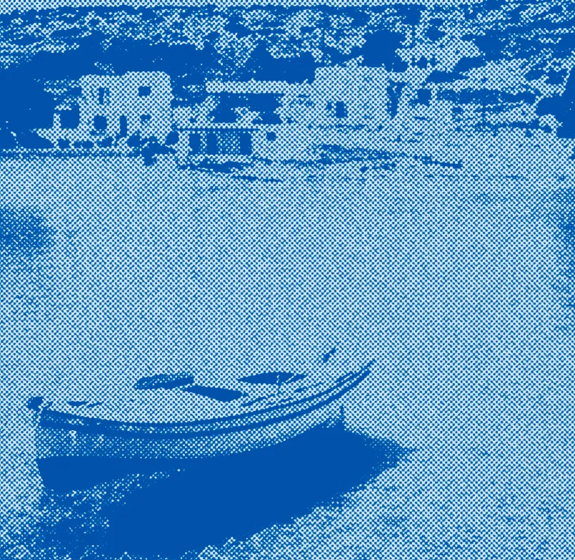
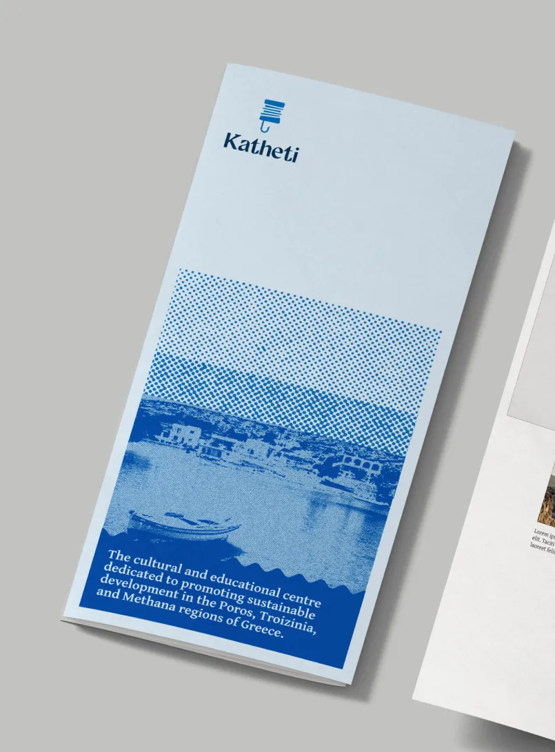
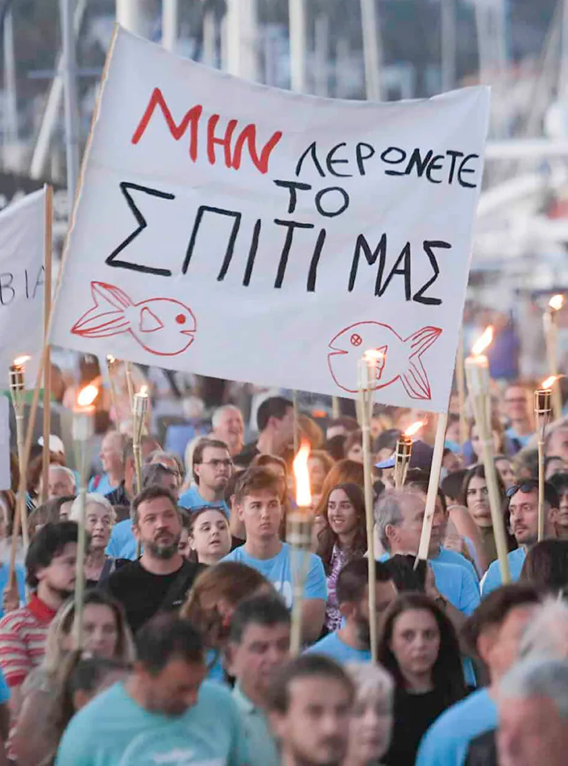
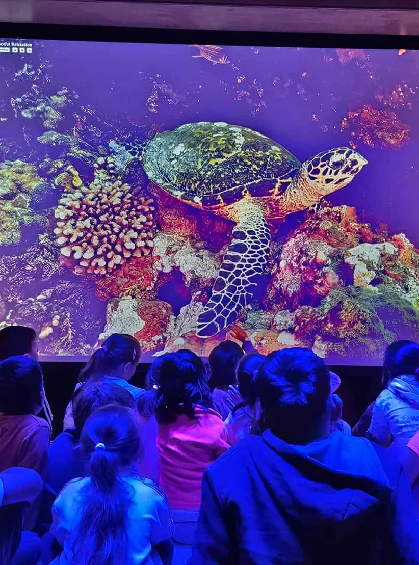
Based on the beautiful Greek Island of Poros, Katheti is a not-for-profit community anchor organisation aiming for the sustainable development of the area - Poros, Troizinia and Methana, through culture and education. It’s an organisation promoting education, culture and environmental stewardship and fostering tourism to stimulate the local economy.
Brief
Katheti had grown quickly and in different directions. The challenge was to let visitors and partners feel a strong and easily understood narrative coming through as well as to underpin services with a solid what's on section and directory. The site would be bilingual and manually translated into Greek to ensure retention of nuance and meaning.
Approach
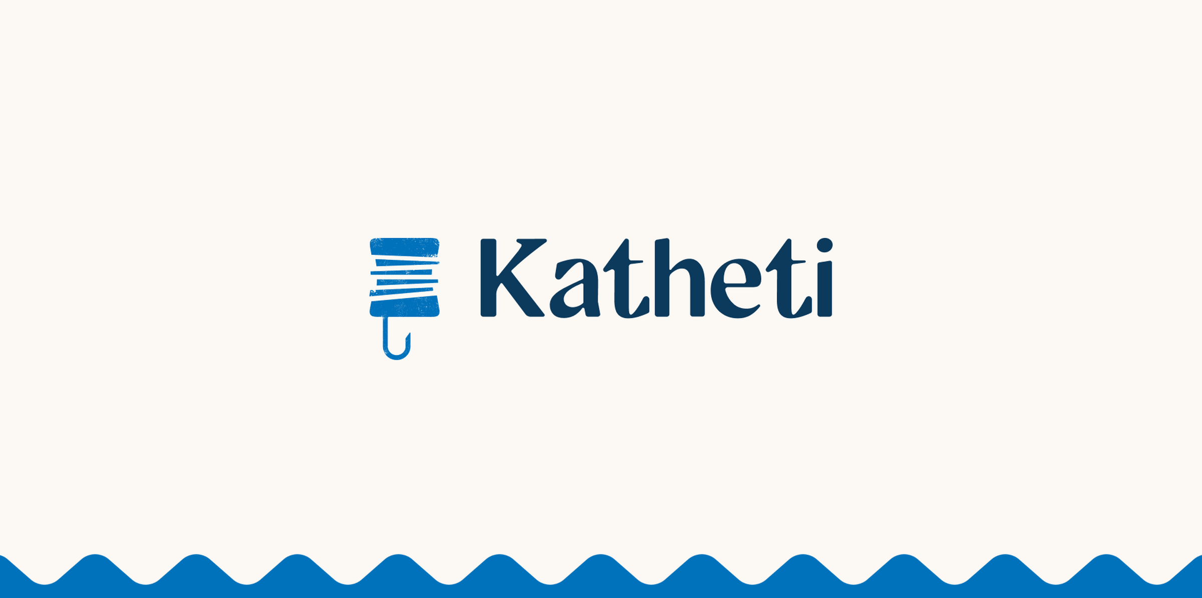
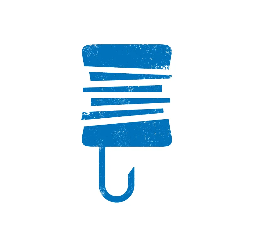
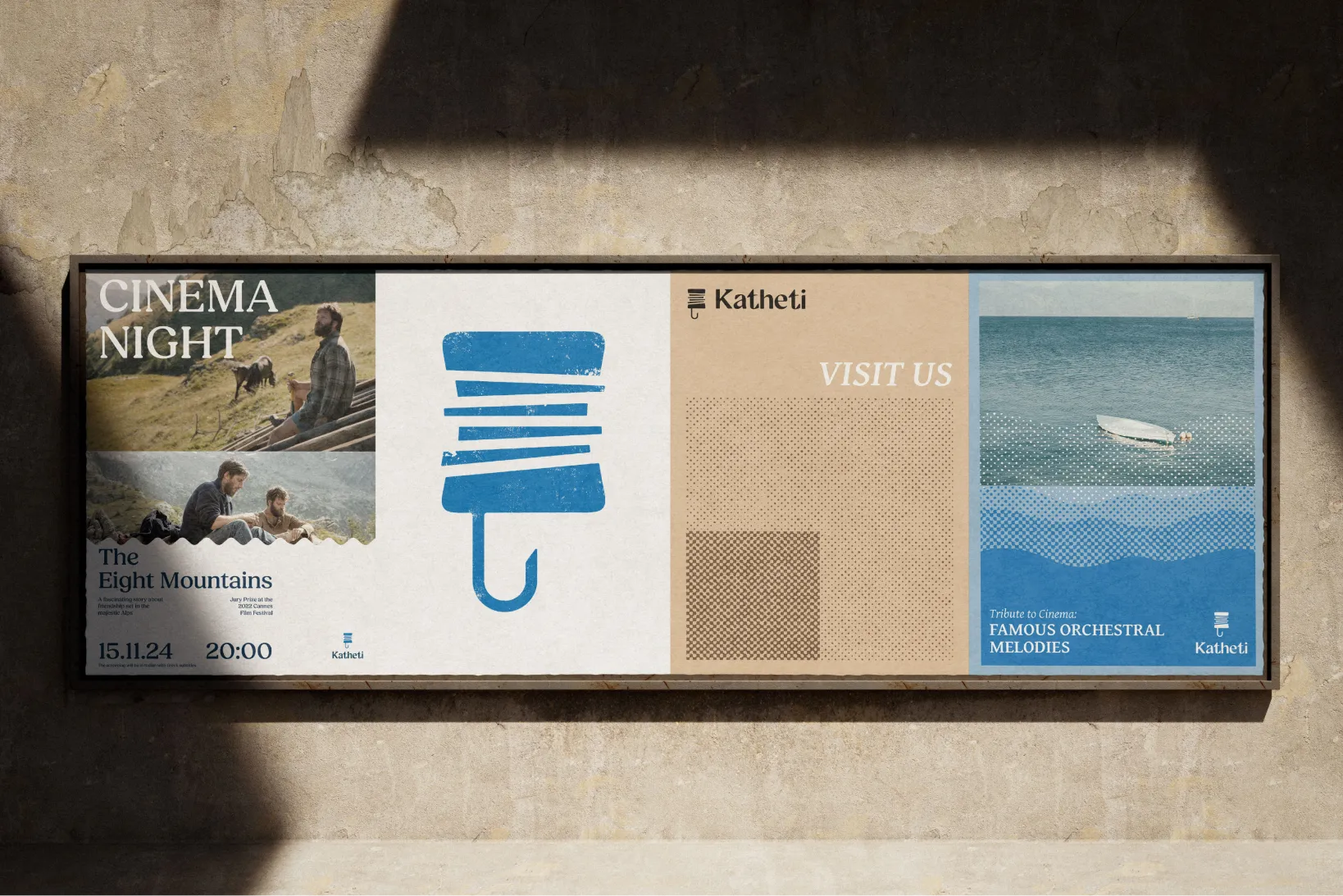
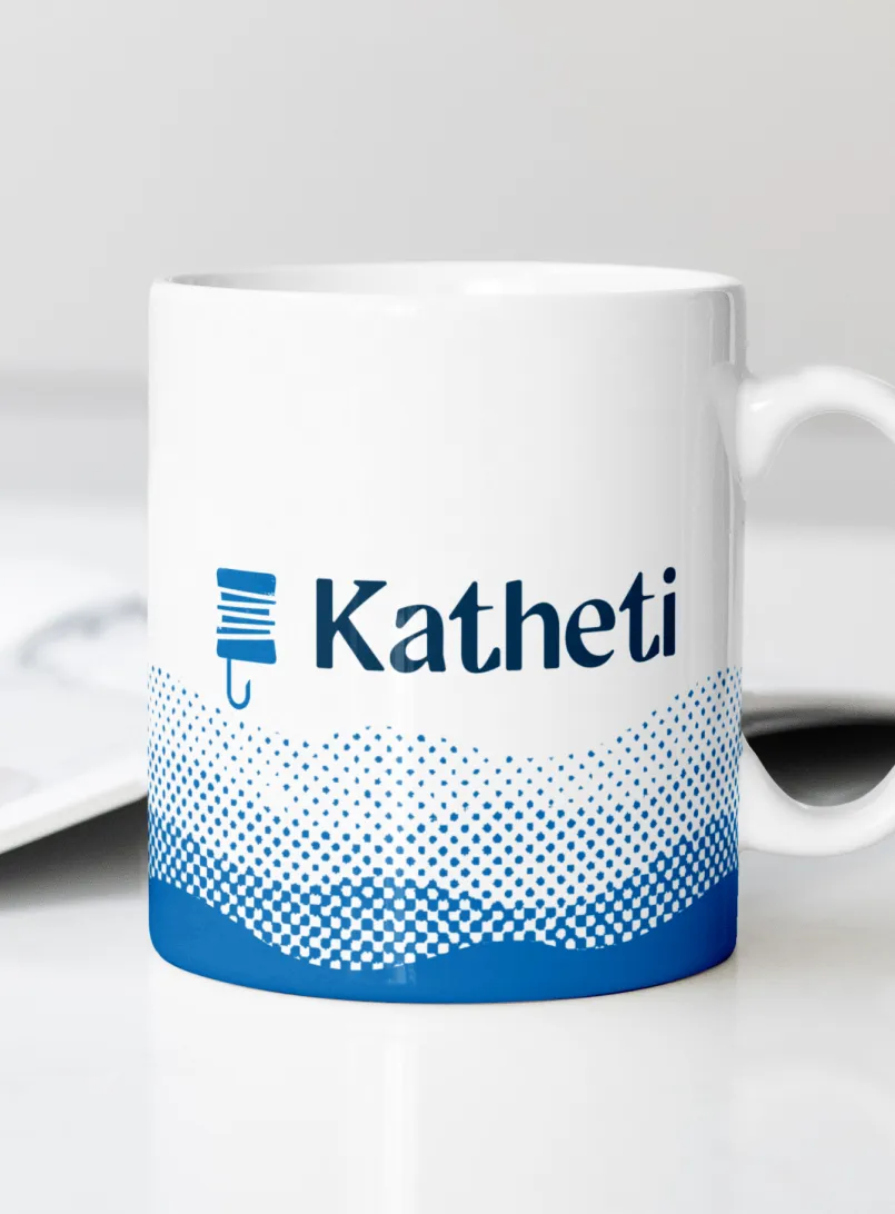
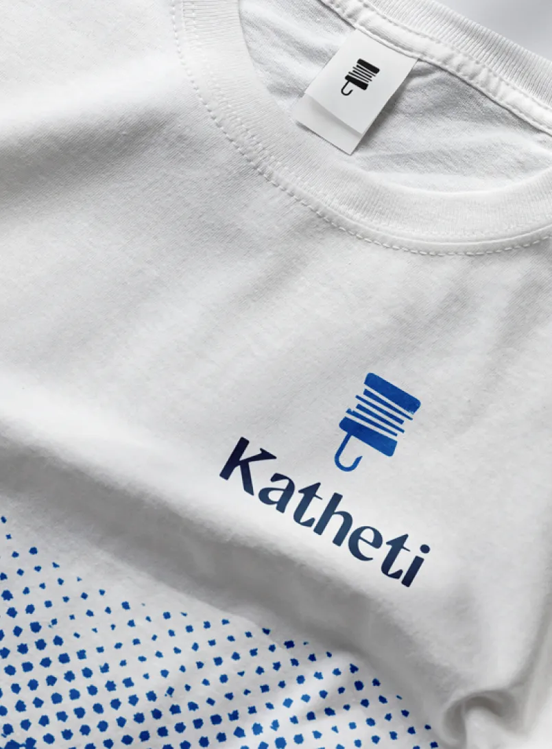
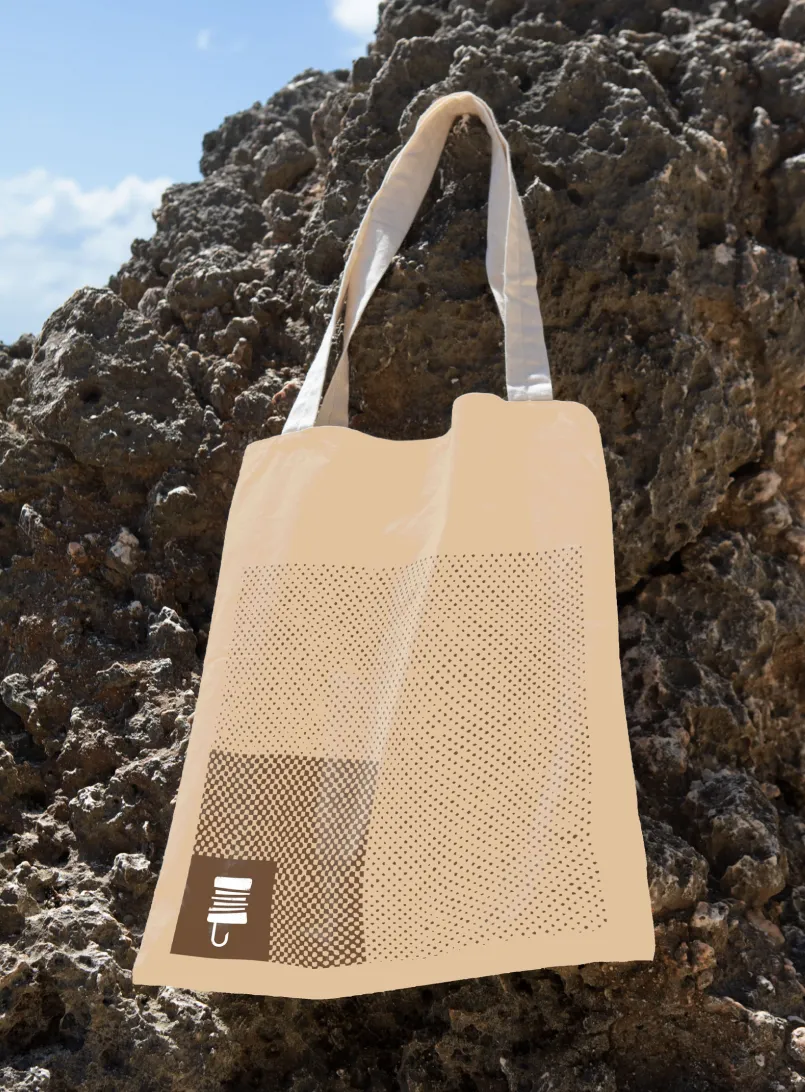
We conducted a series of online workshops to dicover the brand story of Katheti and refresh their visual identity. Maintaining the tradisional Greek floating fish hook as the symbol - the meaning of the word Katheti.
We did a website development workshop to enable us to create a site map and wireframes then a full website prototype in Figma for client review before building out the website in full. Throughout, the focus was on making things more usable and easier to understand rather than adding layers.


Challenges
One of the main challenges was the breadth of what Katheti does. Culture, education and environmental work can easily feel disconnected if they’re not framed properly. The risk was either over-simplifying and losing meaning or overwhelming visitors.
There was also a balance to strike between local relevance and wider ambition. The organisation is rooted in its community, but also wants to position itself as a model for other areas. The brand and site needed to support both without feeling stretched. A large part of its work is in maritime environmental campaigning but this had to find its place in the website without taking over from the community aims.
On the website side, the challenge was keeping things flexible without making the system complicated. It needed to work for different types of content, while still being easy for the team to update and maintain. And it needed to be fully bi-lingual without leaning on auto translation.
Solution
We developed a clear, simple brand that reflects Katheti’s role as a community organisation without muddying the water. The visual approach is stylish yet calm and grounded, allowing content and activity to lead rather than relying on heavy styling.
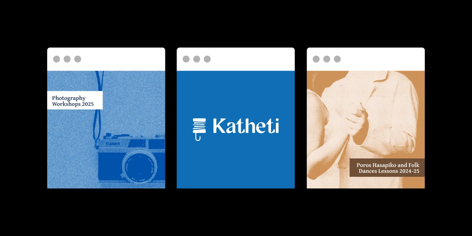
The website is structured around how people actually engage with Katheti — what’s on, what’s happening and how to take part. Content types such as what's on, directories and updates are consistent and easy to navigate, helping users find what they need quickly.
We built in flexibility and provided WordPress training so the team can add and manage content without relying too much on technical support. The result is a site that can grow with the organisation as things develop.
Impact
The website now provides a confident and assured portal to island life for both locals and visitors and gives a clear and succinct picture of all the great work Katheti does, and is being held up as an exemplar to other community anchor organisations in Greece.