Creative Glasgow
Brand Identity / Typography / Digital Design
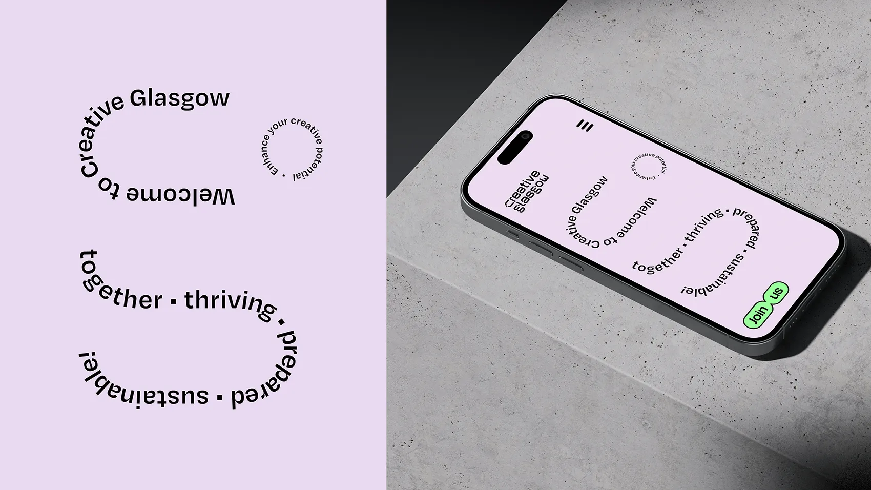
Bold Studio crafted a custom brand and typeface for Creative Glasgow, a hub for Participatory Arts. Rooted in the city’s identity, the bespoke typography blends Glasgow’s artistic heritage with its industrial innovations. The result is a contemporary, expressive system designed for connection, clarity, and creative impact.
Brief
Creative Glasgow is a city-wide initiative dedicated to empowering creative practitioners across Greater Glasgow, regardless of discipline, background, or career stage. With a strong focus on inclusion, sustainability, and social justice, it supports a thriving, equitable, creative and cultural sector.
As a central hub for the city’s creative community, Creative Glasgow fosters meaningful connections, encouraging collaboration, knowledge exchange, advocacy, and shared opportunities.
Our challenge was to craft a visual identity that embodied this spirit of connection while staying rooted in Glasgow’s distinct cultural landscape.
Challenges
Our challenge was to craft a visual identity that embodied this spirit of connection while staying rooted in Glasgow’s distinct cultural landscape.
Solution
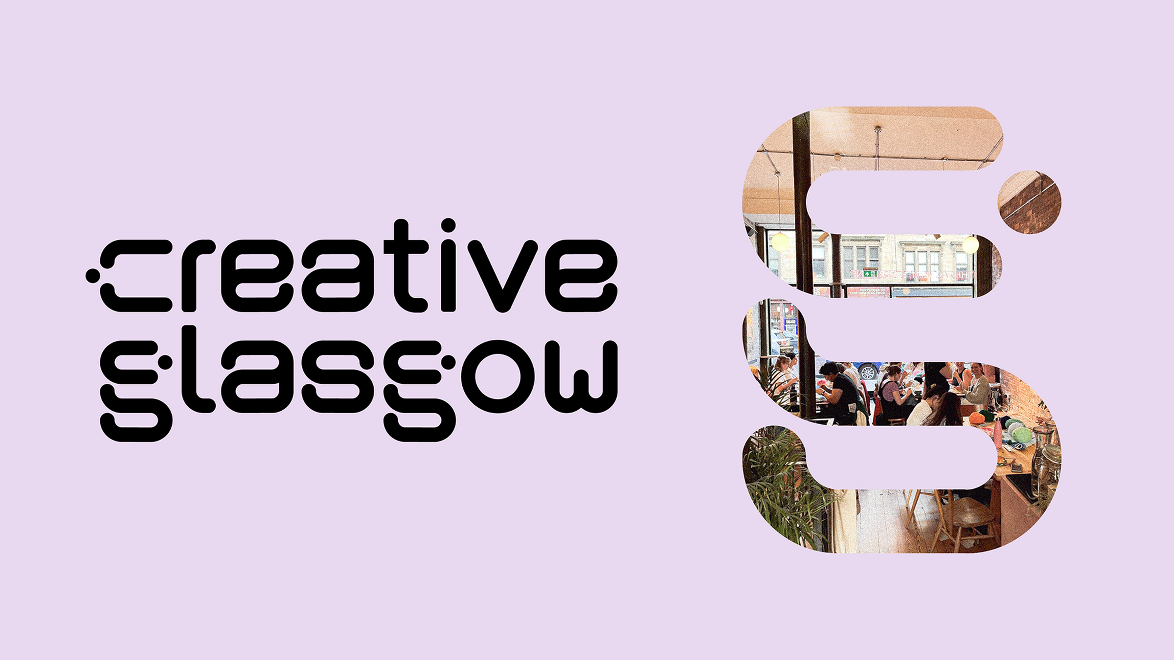
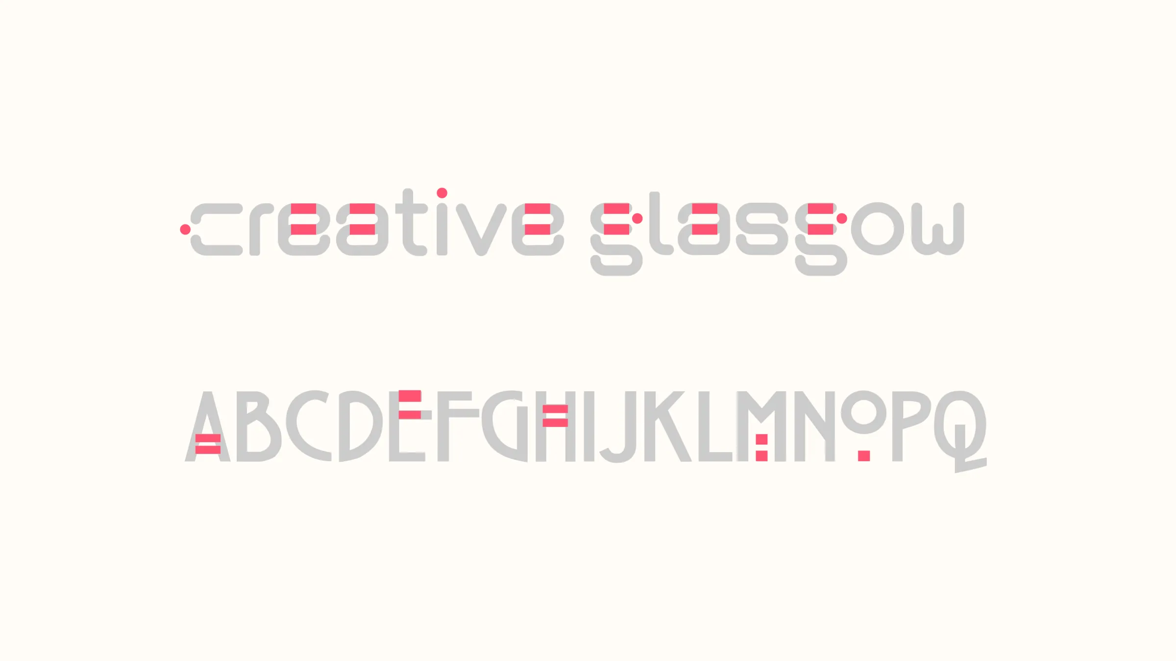
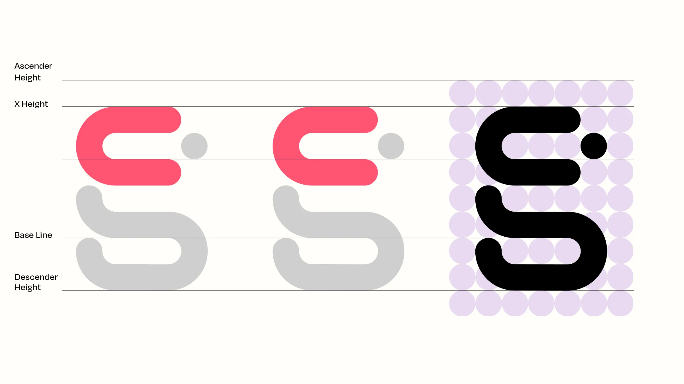
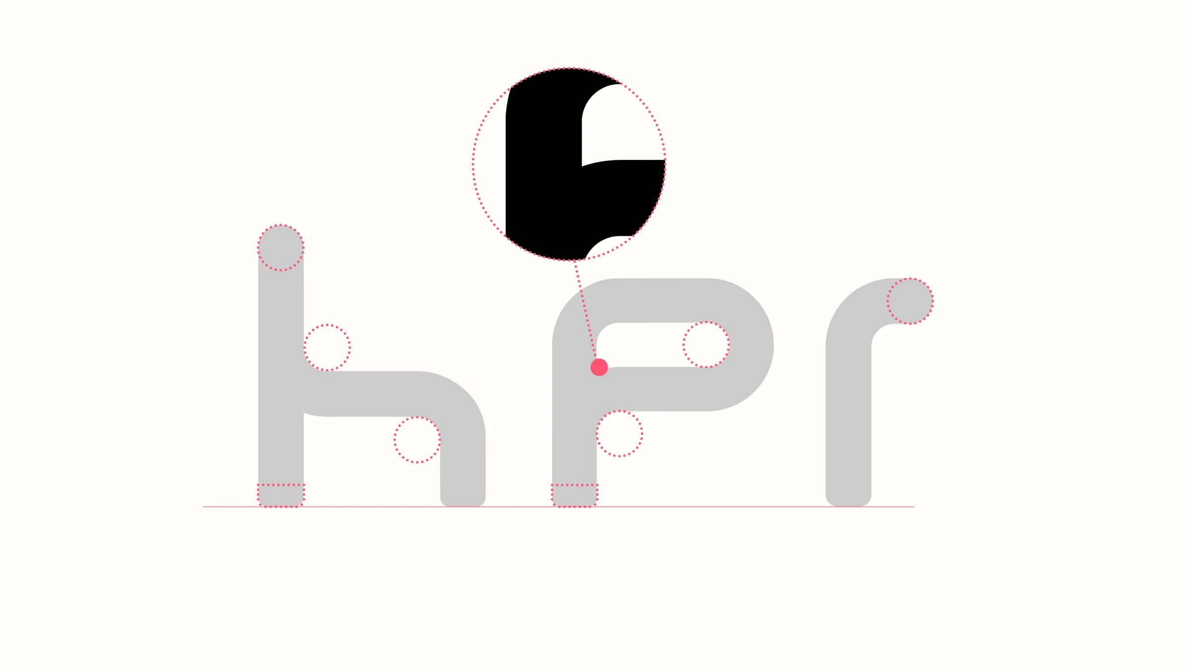
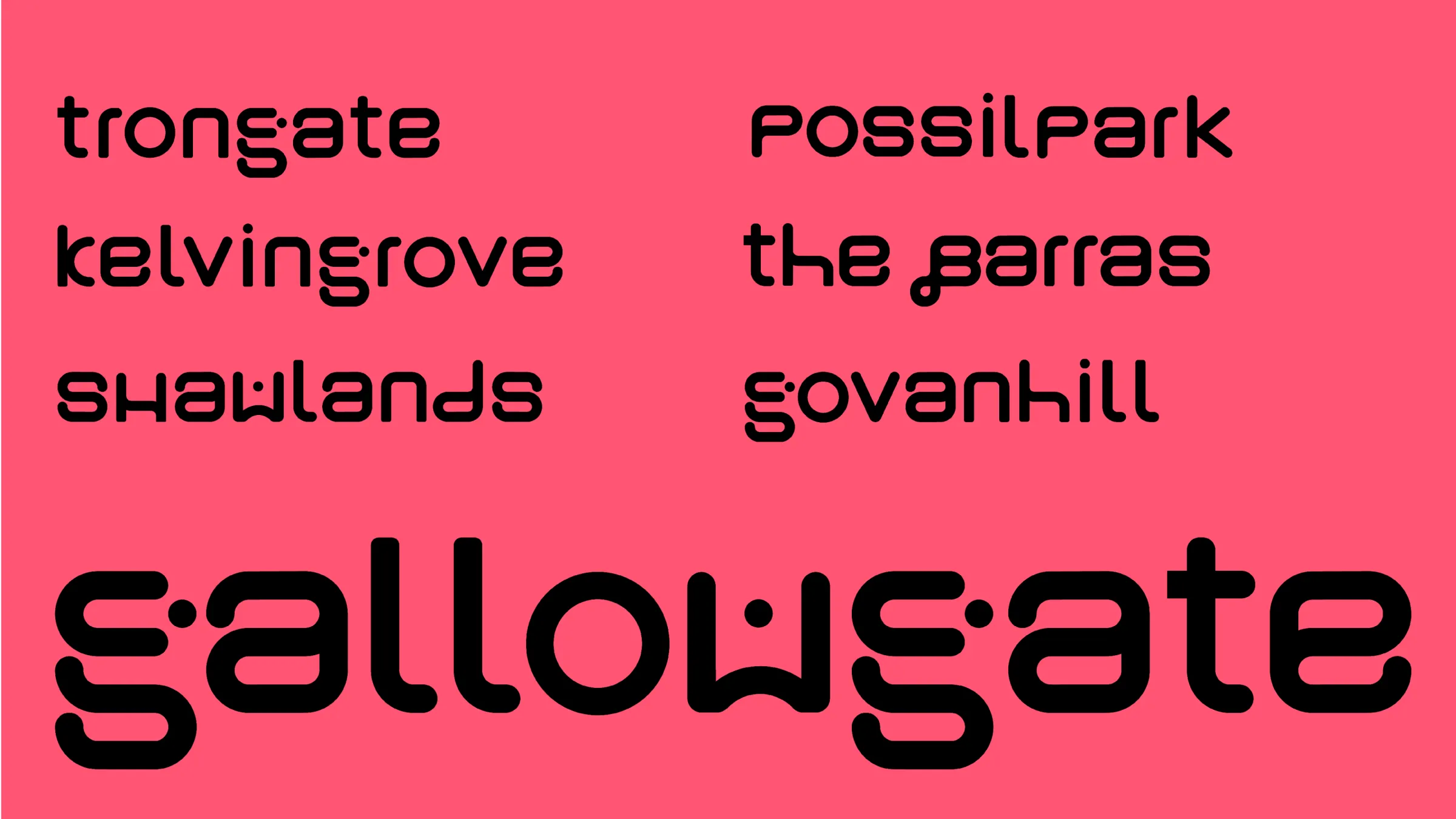
At the heart of the brand is bespoke letter forms developed to reflect the city's creative past, present and future. Our inspiration was taken from a range of sources to best reflect the diversity and sometimes paradoxical and class-divided nature of Glasgow. Our inspiration came from examples such as Glasgow's simple subway system (connection), shipbuilding (industrial heritage) iconic signage (Barrlowlands - a beloved cultural venue) and graffiti (street art). This was then contrasted with artistic heritage with subtle nods to Rennie Mackintosh.
Typography
We crafted rounded, interconnected forms to create letters that are both geometrically precise and fluid. This structured yet expressive approach reflects the city’s ongoing energy of creativity and it's industrial past.
Rather than rely on overused visual symbols, we sought to reflect the confidence and originality of Glasgow’s contemporary creative scene, a city rolling with the best of them.
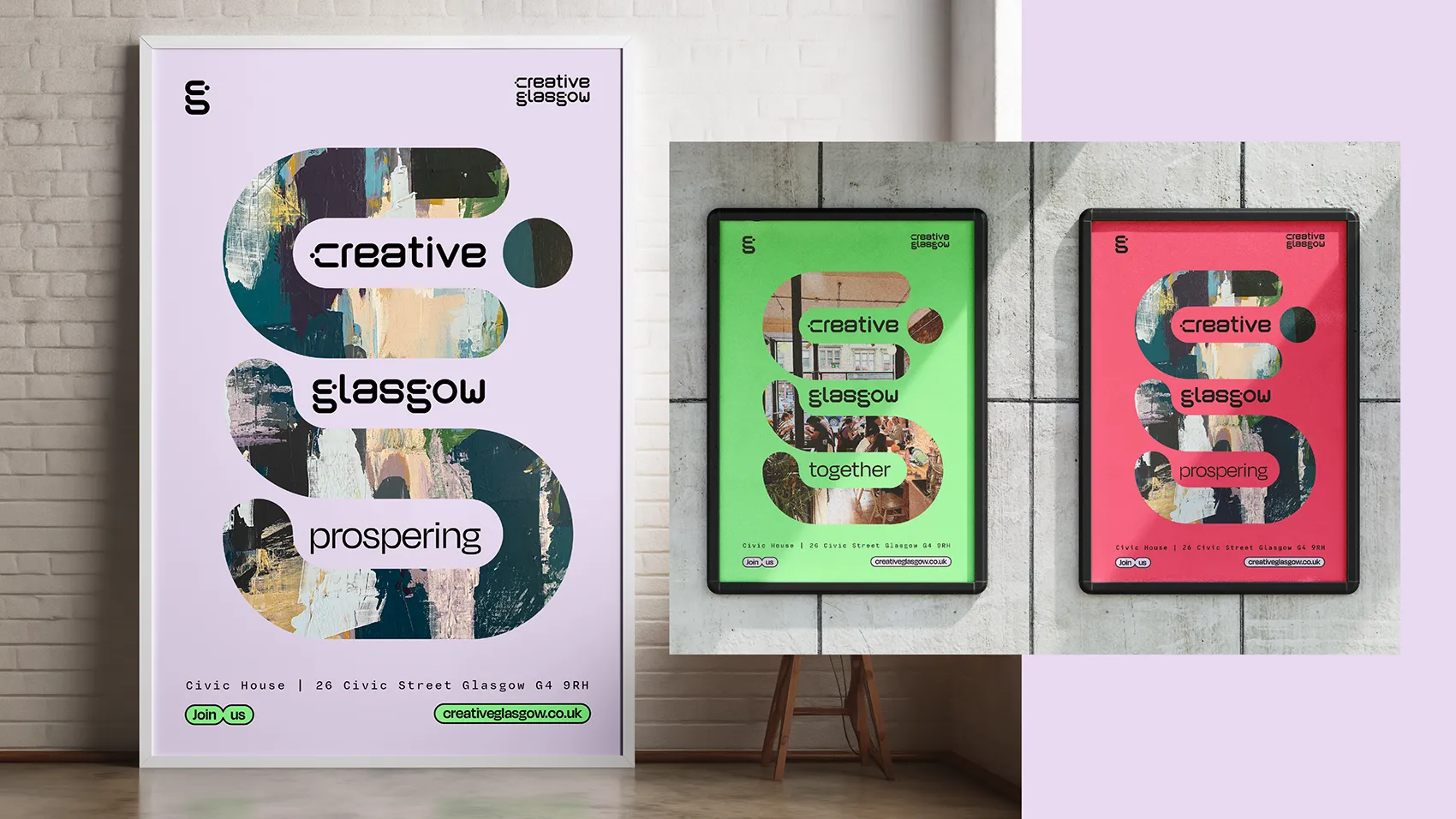
Brand System
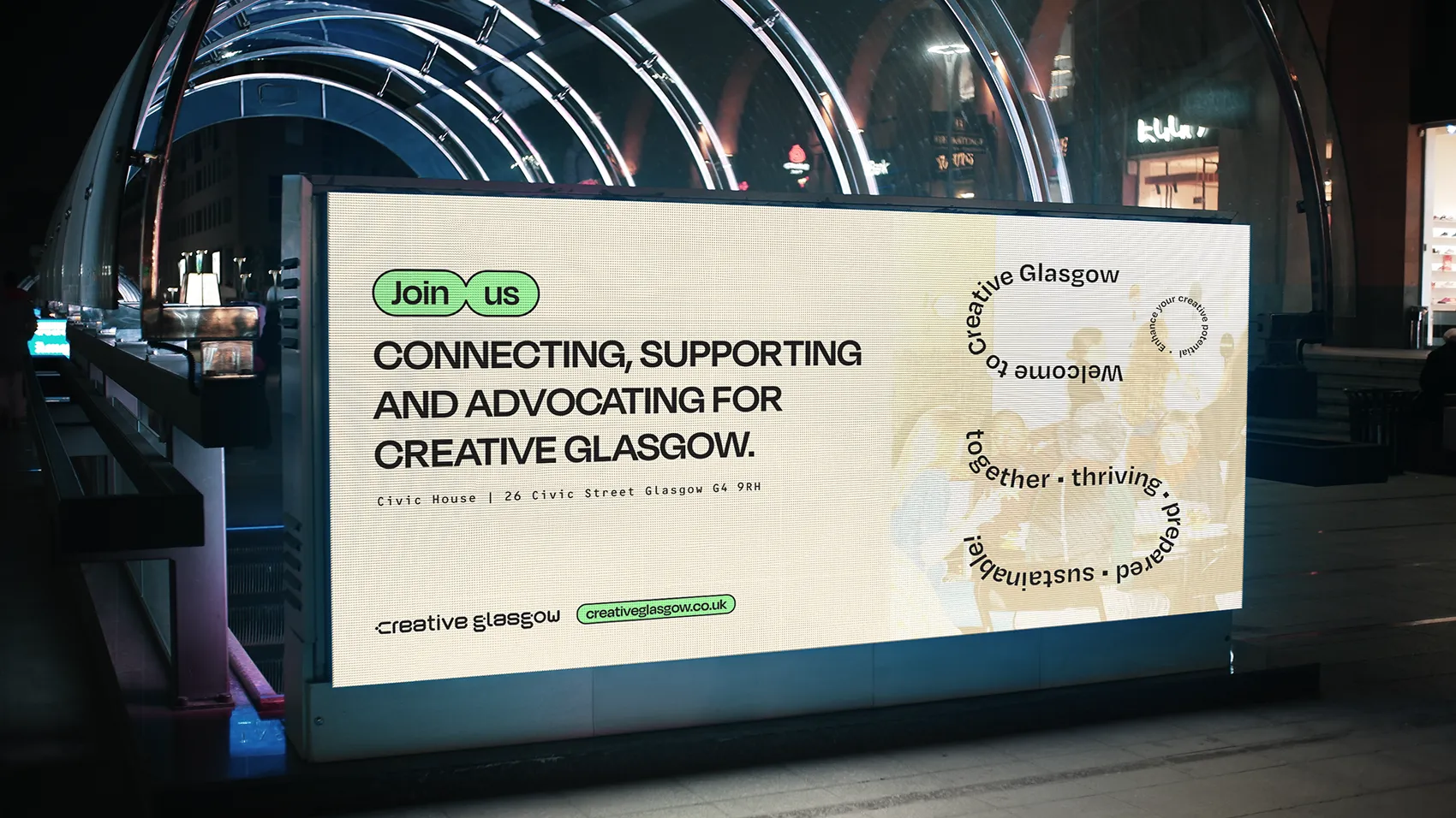
The letters extend beyond static use. They are animated across the website, used in motion for social content, and brought to life through a dynamic motif that acts as a centre piece. This symbol houses imagery, moving type, and functions as a flexible brand device.
To complement the typography, we introduced interlocking bubbles, visual metaphors for collaboration, diversity, and community. Together, the letters and visual system form a distinctive, accessible identity that invites participation while maintaining a creative edge.
Digital Design
every stage of this project honours the interconnected nature of Creative Glasgow, the website being no exception. With an emphasis on showcasing artists and promoting networking events alike, we were able to design a bespoke and unique website that serves the creative scene of Glasgow City.