Commonfuture
Brand Identity / Brand Strategy / Web Design
Commonfuture needed a distinctive, flexible brand that reflects its people and planet-centred values and highlights its expertise in architecture and consultancy. Clear messaging and a warm, professional identity were key to helping it stand out, build partnerships, attract talent and win work that improves lives and reduces environmental impact.
Brief
Bold Studio were tasked to develop a fresh brand strategy and visual identity for Commonfuture, formerly John Gilbert Architects, that reflects the practice’s commitment to people, communities and the planet. They wanted a brand that would help reposition the practice as a medium-sized, multi-skilled and technically proficient organisation with influence beyond Scotland.
Not simply a small architectural firm known for specialist retrofit work, they wanted to clarify the breadth of their architecture and consultancy services, support growth in higher-value commissions and business partnerships, and appeal to clients, collaborators and emerging talent.
Approach
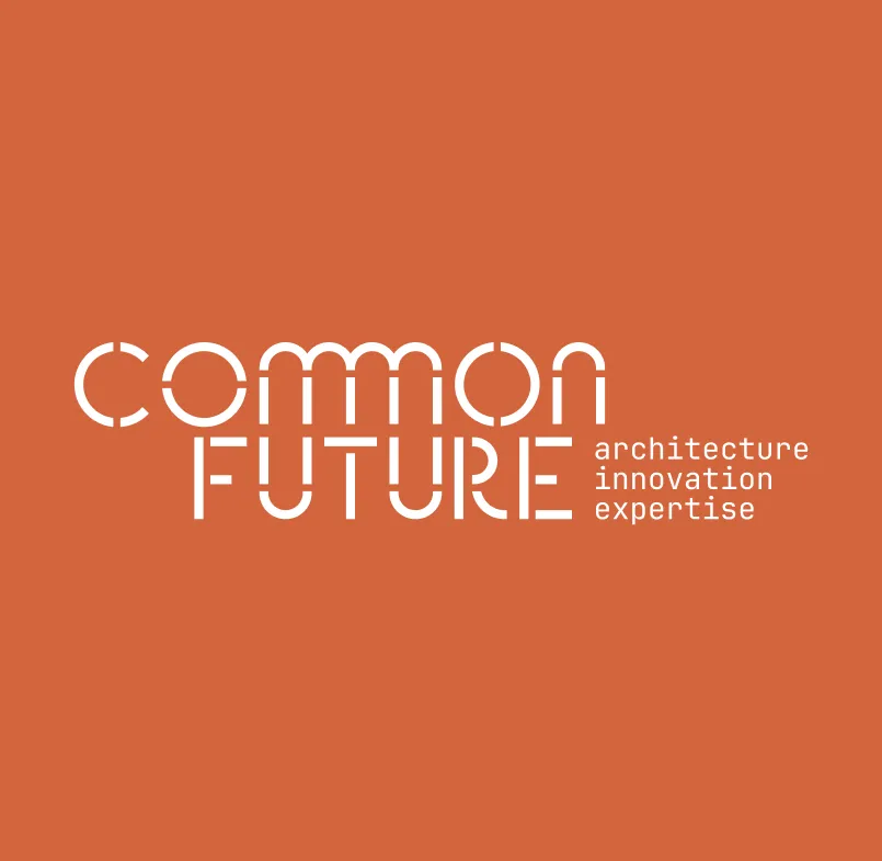
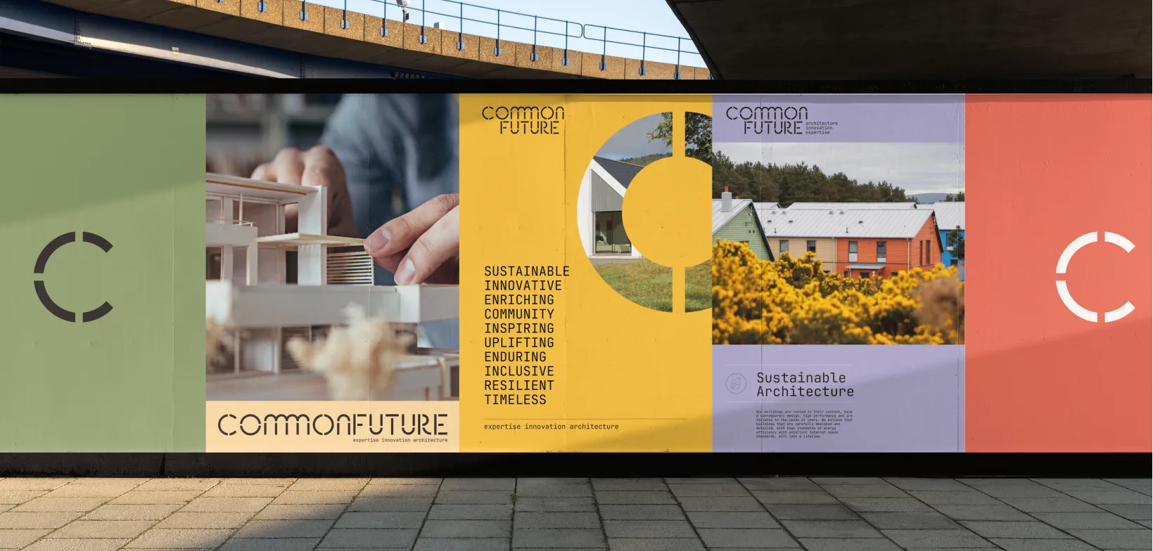
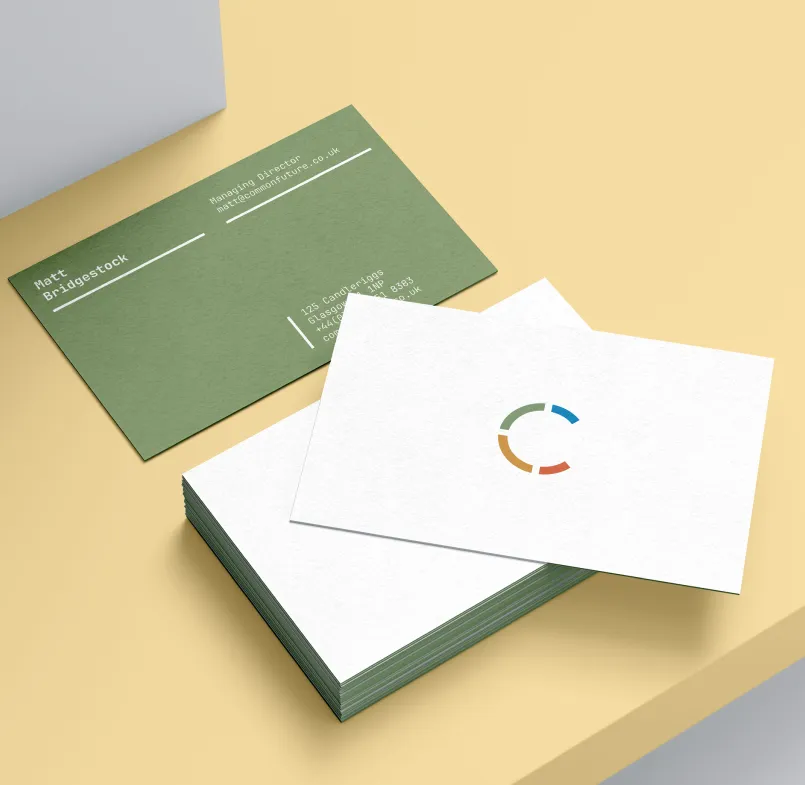
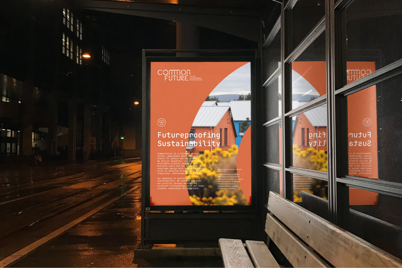
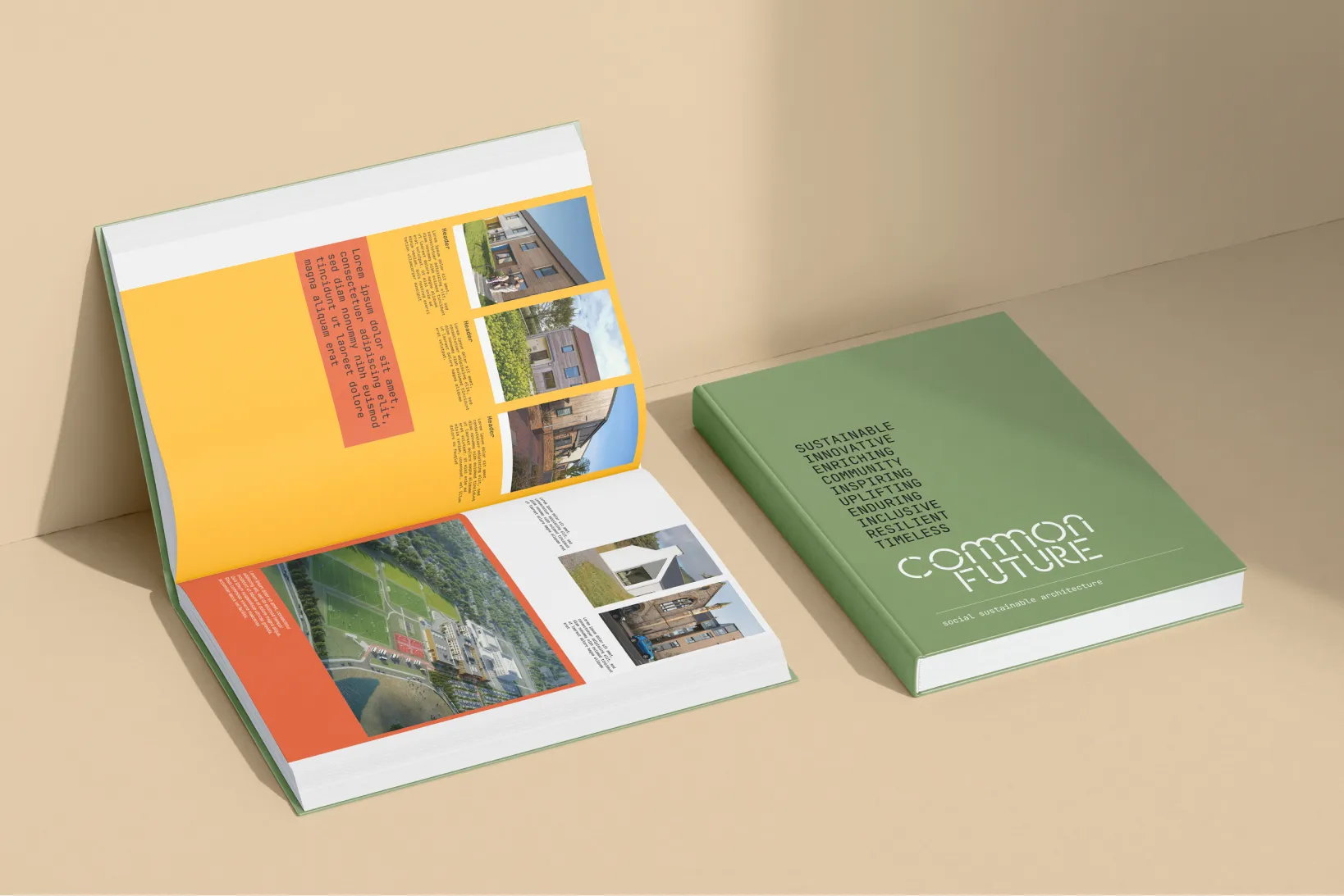
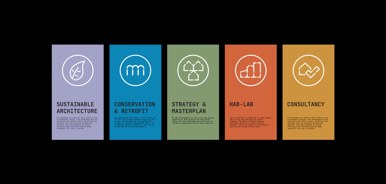
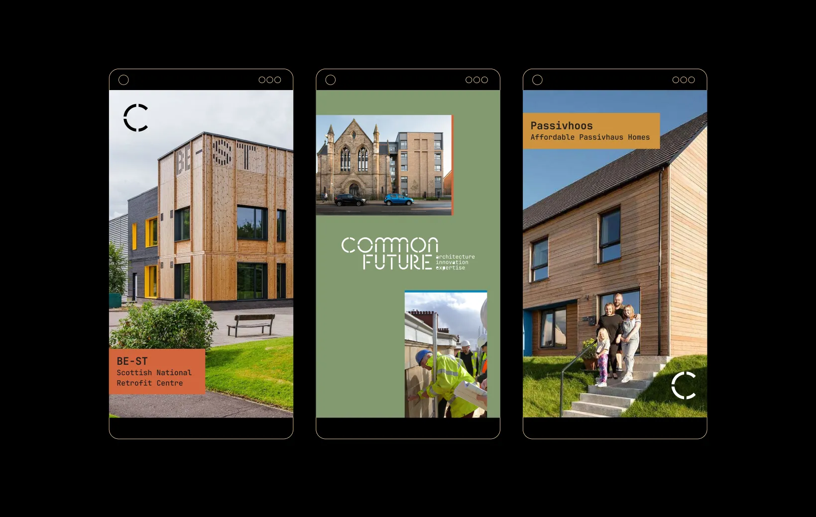
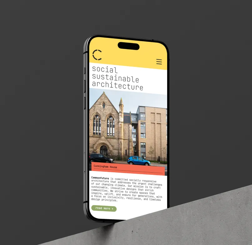
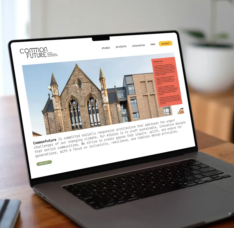
Building the identity around Commonfuture’s heritage, social purpose and expertise in sustainable design were integral to the practice rather than as a niche or marketing claim. We developed a distinctive wordmark, motif and further graphic elements -including use of colour - while ensuring the identity worked across the practice and its consultancy, from detailed drawings and proposals to the website, reports and case studies.

Challenges
The new identity had to cover several aspects: communicating a wider, more mature practice without losing its approachable character, balancing design quality with technical performance, and expressing a strong environmental and social agenda without appearing trend driven. It also needed to distinguish Commonfuture in a busy architectural sector, while remaining legible and recognisable at small sizes on dense technical drawings. Also, the brand had to serve different audiences and offerings - from public-sector housing clients and community groups to consultancy partners.
Solution
The result is a distinctive and adaptable brand system that makes Commonfuture’s purpose, capabilities and expertise clear at every touchpoint. It will position the practice as a trusted, people-centred and technically strong pioneer in socially responsive architecture, capable of delivering both ambitious sustainable work and practical solutions. The new identity, supported by consistent messaging and strong project storytelling, should help attract better-aligned commissions, strengthen partnerships, raise the practice’s profile and make its full range of work - and the people behind it - more visible.